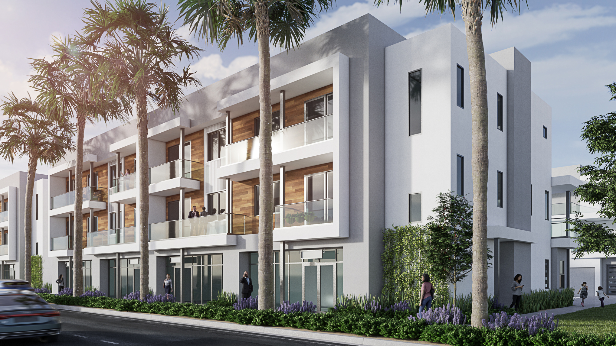
New rendering. Constructive criticism is great appreciated. Thanks.
3 Likes
avoid the poles on the balcony no need
If you’re after a critique on the rendering alone, I have some ideas.
Firstly, it’s a good rendering and well done with the trees and creeping growies on the wall.
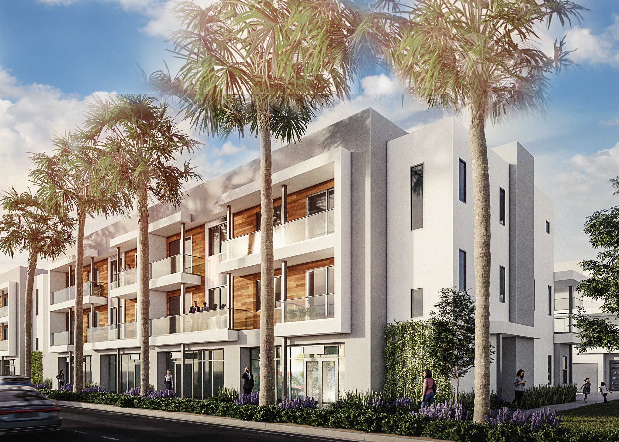
Overall I would reconsider the composition. I would maybe shift the view slightly left and open up the sky a bit. I’ve mocked up an example where I’m at least giving more headroom to the building.
Next I would warm up the image overall. I would also draw attention to the people on the balcony and away from the road but adding a darker grade to the lower portion of the image. Incidentally I would avoid adding motion blur to the cars and simply use lens blur instead. Motion blur here seems uncomfortable as it’s daytime, and giving the impression of speeding cars so close to your client’s new building doesn’t do any favors to the image.
Next I would round some of the corners. Your model has all sharp corners. In Photoshop I just used a small white brush to add some rounded effect to the corners so they catch light.
Then I would take some time to make nice reflections in the windows. Either throw in some models so we see some interior or do it in post. At least do something to make the shops at ground level appear more interesting. I mocked up some reflections but they are not as good as what you could get with some more care.
A final touch of opening up the shadows a bit and adding a wee bit of contrast, and this is a better image.
2 Likes
I learned a lot from your post… Too bad the OP never bothered…